Configure responsive images without application code
- Author
 Joseph TrasattiMember of technical staff
- Published
- Section
- No-Code
- Length
- 7 min read3 sources cited
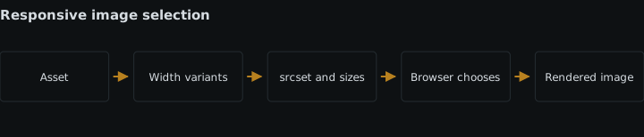
Configure the media service to produce several intrinsic widths, then map those URLs into the no-code platform’s responsive-image fields with accurate selection hints. Keep width and height attributes on the rendered image. CSS may control display size, but it cannot reduce the bytes transferred for an already selected source.
Prerequisites
Use a CMS, site builder or media plugin that lets you set, generate or preserve all four parts of an image element: a fallback source, multiple width candidates, a sizes value, and intrinsic width and height attributes. If the platform exposes only one image URL and a CSS width control, it cannot complete this setup without changing the template or plugin.
The source asset also needs to be large enough for the widest place it will occupy. This process creates smaller delivery variants; it does not establish that enlarging a small original produces a suitable large image.
Configure responsive delivery
-
Record how wide the image is in each layout
Inspect the published layout at each point where the image’s container changes. Record the image’s rendered width as a viewport-relative rule rather than collecting device names. For example, a hero might occupy the viewport on a narrow layout and a bounded content column on a wide layout. A card may move from one column to two or three columns as the viewport grows.
This layout map is required because responsive delivery has two separate inputs: the available files and the width the page expects the image to occupy. The browser cannot infer the second input from the files alone. A wider viewport can even produce a narrower image when a grid gains another column.
Do not treat
width: 100%as delivery configuration. CSS changes the displayed dimensions after a source has been selected; it does not turn one large downloaded file into a smaller transfer. Cloudinary’s responsive-image documentation, updated June 19, 2026 makes the same distinction: sending one high-resolution image and resizing it in the browser wastes bandwidth on smaller displays. Its HTML-based option creates transformed widths forsrcset, leaving source selection to the browser.This approach is the right fit when the no-code platform exposes responsive-image fields or emits them from a media integration. If it hides the rendered markup, first check whether media handling inside the no-code builder can preserve those fields. A CSS-only image control is the wrong tool for this task.
-
Generate several intrinsic-width candidates
In the media service or responsive-image tool, select the source asset and generate width variants. Each result must be a genuinely resized resource whose intrinsic width matches the width attached to its candidate entry. A list such as
480w,800wand1200wdescribes three real files or transformation URLs, not three display instructions for the original.Prefer automatic breakpoints when the service can inspect the asset. Automatic breakpoint generation derives candidate widths from that particular image and the byte-size differences between successive resized versions. The mechanism matters: equal steps in pixels do not necessarily produce useful steps in transferred bytes, because two nearby widths may have little size difference. Asset-derived breakpoints can omit candidates that add little practical separation.
Automatic generation is not the browser-selection step. It only supplies the candidate widths. The page must still publish those candidates and describe its layout. It also does not remove the need to review the smallest and largest outputs against the actual slots recorded in step 1.
Manual widths are the better answer when the layout has a small, fixed set of known slots and the no-code system cannot accept generated breakpoint data. Their cost is maintenance: when the content column or grid changes, someone must reconsider both the candidate list and the selection hints. Automatic breakpoints reduce that candidate-planning work, but they cannot know how wide the page will render the image.
-
Enter the candidates and the page’s selection hints
Put every generated URL into the builder’s
srcsetor responsive-sources field and label it with its true intrinsic width using awdescriptor. Set a normalsrcvalue as the fallback. Do not mix claimed widths with files of different natural widths.Then translate the layout map from step 1 into the platform’s
sizesfield. Each entry consists of a layout condition and the image width under that condition, followed by a final default width. The value should describe the image slot, not the source file. If an image occupies the full viewport in one layout and half in another, those are the factssizesneeds to express.The HTML Standard’s image-selection rules, accessed August 26, 2026, explain the mechanism: the browser combines each candidate’s
wdescriptor with the rendered size declared bysizes, calculates an effective pixel density, and chooses a resource. Screen density, zoom and potentially network conditions can affect that choice. The standard also requires a width descriptor on every candidate whensizesis present, and the descriptor must match the resource’s natural width.This is why a candidate list without an accurate
sizesvalue is unfinished. The media service knows the available intrinsic widths, while only the page knows its layout. If the layout changes from one column to three, updatesizes; regenerating the files alone does not correct the hint.Keep cropping and aspect ratio separate from width selection. The steps here assume every width candidate presents the same content at the same aspect ratio. If narrow layouts need a different crop, that is art direction rather than a simple intrinsic-width set and needs controls beyond the facts covered here.
-
Preserve intrinsic width and height on the image element
Enter the source image’s width and height in the builder’s dimension fields, or confirm that the media integration writes them to the final
<img>. These attributes describe the aspect ratio available during layout; CSS can still make the image fluid within its container.The page remains responsible for these attributes even when the media service generates every width candidate automatically. According to web.dev’s guidance on preventing layout shifts from images, accessed August 26, 2026, browsers use
widthandheightto calculate an aspect ratio and reserve space before the file finishes loading. Without dimensions, the page cannot allocate that space from the initial markup, so surrounding content can move when the image arrives.Use candidates with one aspect ratio so the same intrinsic dimensions describe the set. The numeric attributes need not equal the image’s final CSS width; their ratio is what lets the browser derive the corresponding height as the responsive layout changes.
Omitting the attributes is the wrong trade when the builder offers them. Responsive source selection may reduce unnecessary transfer, but it does not itself reserve layout space. If a plugin removes the dimensions or responsive attributes after publication, use the CMS media-plugin troubleshooting workflow before adjusting the candidate widths again.
-
Publish and inspect the rendered result
Preview the actual published page, not only the visual editor. At a narrow layout, confirm that the rendered element contains the fallback source, the full candidate list, the intended
sizesvalue, and both dimensions. Repeat at every layout change recorded in step 1. The HTML should stay the same while the browser’s selected resource can change with the layout and display conditions.Check the requested image URL or intrinsic width in the browser’s page inspector at representative narrow and wide layouts. A visibly small image that still requests the largest candidate usually points to an inaccurate or missing
sizeshint, a candidate list that was not preserved, or a platform that replaced the responsive markup with one URL. Changing CSS alone does not fix that transfer.Keep format and compression decisions outside this check. They can be added through automatic format and quality delivery, but they do not replace width candidates, selection hints or dimensions.
Expected result
The published image element contains multiple real intrinsic-width candidates, a sizes value that describes the image’s slot at each layout, a fallback source, and width and height attributes with the correct aspect ratio. The browser can select among smaller and larger resources without client-side application logic, while the reserved image area prevents responsive selection from introducing layout shift.
Sources
- responsive-image documentation, updated June 19, 2026cloudinary.com
- HTML Standard’s image-selection ruleshtml.spec.whatwg.org
- guidance on preventing layout shifts from imagesweb.dev
See also
How to add a scheduled reconciliation to a per-event Cloudinary automation so missed webhooks, failed runs and untriggered uploads still get processed.
Define, test, and version OpenAPI schemas so connector changes do not silently break existing no-code flows.
Store credentials by reference, keep them out of every output surface, and rotate them without breaking a production no-code automation.
Move a production no-code flow from employee ownership to a service principal, preserve every binding, and prepare rotation and emergency transfer.